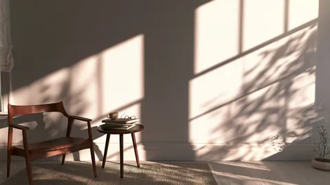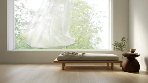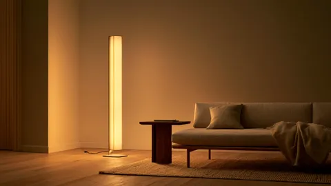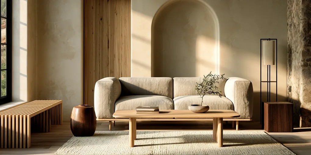
Two rooms. Both have light oak floors, white walls, linen curtains, and natural wood furniture. One feels like a Japandi room. The other feels like an IKEA showroom.
The difference is rarely the individual pieces. It is the proportion of certain things to other things — a balance that most people get wrong without realizing it, because no one has told them the numbers.
There are two ratios that matter most in a Japandi room. Once you understand them, you can look at any space and know immediately what’s off and how to fix it. (If you’re still getting your bearings, here is what Japandi actually is in one page — this article is the math underneath it.)
Why Ratios Matter More Than Individual Pieces
Most Japandi guides focus on what to buy: the right wood, the right textiles, the right ceramics. But a room isn’t made of individual objects. It’s made of relationships between them.
You can have the perfect walnut coffee table, the right linen sofa, the handmade ceramic vase — and still end up with a room that doesn’t feel Japandi, because the proportion of Nordic elements to Japanese elements is out of balance.
Japandi isn’t a list of objects. It’s a ratio between two cultures, held in a specific tension.
The Nordic base needs to dominate — that’s what gives the room its light, its openness, its livability. The Japanese elements need to be fewer, darker, more angular. Enough to anchor. Not enough to take over.
When the Japanese elements are missing entirely, you have a Scandinavian room. When they dominate, you have a Japanese room. Japandi is the narrow range between those two poles, and there are numbers for it.
The First Ratio: Wood Tone — 70 Light, 30 Dark
This is the one that explains the IKEA problem.
IKEA builds almost exclusively in blonde wood: birch, light beech, white-stained pine. Their furniture is well-designed and genuinely Nordic in spirit. The problem is that when people fill a room entirely with light-toned wood — pale floors, pale table, pale shelves, pale chairs — the space reads as 100% Scandinavian. The Japanese element never appears.
The fix is not to abandon light wood. The fix is to introduce dark wood at roughly 30% of the room’s total wood presence.
What counts as light wood (the 70%)
Light oak, white oak, ash, birch, pine in its natural color. The pale, honey-toned, often slightly yellowish woods that Scandinavian design favors. These typically have an organic warmth without heaviness.
In a room, these usually show up as: the floor, the largest furniture pieces (sofa frame, dining table, large shelving unit), and structural elements like window frames or exposed beams.
What counts as dark wood (the 30%)
Walnut, dark oak, cedar, teak, charred wood (shou sugi ban), lacquered or stained wood in deep brown or near-black. The heavy, grounding, earth-toned woods that Japanese interiors have used for centuries.
In a room, these usually show up as: a coffee table, a side table, a chair frame, a shelf edge, a decorative tray or bowl, a lamp base.
Why 70/30 and not 50/50?
Because Japanese interiors are not half Nordic. The Nordic base is what makes the room feel contemporary and livable for a Western lifestyle. The dark wood is the edit — the accent — that shifts the atmosphere. Too much dark wood makes the room heavy and somber. Too little, and it vanishes.
Think of the dark wood elements as weights on one end of a scale. You don’t need many. You just need enough to feel them.
One dark walnut coffee table in a room full of light oak furniture changes the entire atmosphere. That’s the 30% doing its job.
The Second Ratio: Shape — 60 Straight, 40 Curved
This one is less obvious, but once you see it you cannot unsee it.
Scandinavian design loves organic curves. The rounded edges of an IKEA side table, the gentle arc of a Scandi lounge chair, the oval shape of a pendant lamp. These curves are deliberate — they make the room feel warm, approachable, slightly playful.
Japanese furniture is almost entirely composed of straight lines and right angles. The low square coffee table. The rectangular wooden tray. The grid of a shoji screen. The clean, hard edge of a lacquered cabinet. Japanese design does not round things to make them friendlier. It makes them precise.
A room where everything is round reads as Scandinavian. A room where everything is angular reads as Japanese or industrial. Japandi lives at roughly 60% straight lines, 40% curves.
Reading the shapes in your room
Look around and mentally count the silhouettes of your furniture and objects.
Curved: round side tables, oval mirrors, arched floor lamps, circular plates displayed on a wall, round baskets, globe pendant lights.
Straight: rectangular coffee tables, square cushions, grid-pattern shelves, straight-armed sofas, angular vases, square picture frames.
If your curved count is significantly higher than your straight count, the room is pulling Nordic. Adding one or two strongly geometric pieces — a rectangular tray, a square mirror, a low angular shelf — will shift it back.
The shape of furniture legs matters too
This is a detail that has a surprisingly large effect. Furniture with tapered legs that flare outward and end in a slight curve reads as Scandinavian. Furniture with straight, vertical legs in dark wood reads as Japanese. Even the same tabletop will feel different depending on what is holding it up.
If you have an otherwise neutral table or sofa on splayed Scandi legs, and you want the piece to read more Japanese, the simplest intervention is to find a version of it with straight, dark-stained legs.
The Checklist: Reading Your Own Room
Use this as a quick audit. You don’t need to be precise — the point is to identify the direction of the imbalance.
Wood tone check
Walk through your space and roughly estimate the proportion of light wood surfaces to dark wood surfaces. Include floors, furniture, shelves, frames, and decorative objects.
If your estimate is 90% light / 10% dark or more extreme — you are missing the Japanese anchor. Look for one or two dark wood pieces to add: a walnut side table, a dark-stained tray, a charcoal-framed mirror.
If your estimate is already near 70/30 — your wood tone balance is good. The issue is likely elsewhere.
If dark wood dominates — the room is probably reading as too heavy or traditional. Introduce more light wood surfaces, or let the floor and walls (if light) provide the needed counterbalance.
Shape check
Count the dominant shapes in your furniture: tables, lamps, mirrors, baskets, decorative objects. How many are curved or round, and how many are angular or rectangular?
If curved significantly outnumbers straight — the room reads Nordic. Add a rectangular coffee table, a square mirror, or angular shelving.
If straight significantly outnumbers curved — the room may feel cold. Introduce softer shapes: a round pendant light, a curved ceramic bowl, an organic-edged tray.
If they’re roughly balanced near 60/40 straight — you are in range. Fine-tune from there.
A Note on Why This Feels Counterintuitive
Most design advice is qualitative: “add warmth,” “create contrast,” “find balance.” This is useful but vague. When you’re standing in a room that doesn’t feel right and can’t identify why, qualitative advice doesn’t give you anywhere to start.
The ratios do.
They are not rigid rules. A room at 65/35 wood tone is not wrong. A room at 55/45 shapes is not failing. They are starting points — a way to look at your space with enough precision to identify where the imbalance is, rather than guessing.
In Japan, this kind of proportional thinking has a long history. The relationship between filled and empty space, between heavy and light elements, between the grounded and the elevated — these are not left to feeling alone. They are observed, adjusted, refined.
That sensibility is part of what makes a Japanese room feel different from a Scandinavian one that otherwise looks similar. Not the objects. The ratios between them.
One Place to Start
If you take one thing from this article, let it be this:
Before you buy anything, do the wood tone check. Walk through your space and ask whether dark wood is present at all — and if so, whether it’s strong enough to be felt.
In most rooms I describe to people, the answer is that the dark is either absent or too scattered to register. One or two pieces of genuinely dark wood, placed where the eye naturally rests — a coffee table, a shelf beside the sofa — is often all it takes to shift a room from “Scandinavian” to “something quieter.”
That shift is the Japandi ratio doing its work.