There is a moment that happens to almost everyone who tries to create a Japandi room.
You start well. White walls, light oak furniture, linen textiles. It looks clean. It looks calm. And then, almost without thinking, you add something: a dusty rose throw pillow, an aqua ceramic vase, a mustard yellow candle. Because the room felt a little flat. Because you wanted you in it somewhere.
And then the room stops feeling like Japandi.
You can feel that something shifted, even if you can’t say exactly what. (Color is one of the most common ways the Japanese part quietly disappears — if you want the bigger picture first, here is what Japandi actually is.)
The problem usually isn’t what you added. It’s the category of color you added.
Why Scandinavian Design Is Actually Colorful
This surprises people, but Scandinavian design — real Scandinavian design — is not a neutral palette. Walk through a traditional Nordic home and you will find bold aqua blues, cheerful yellows, bright reds. Think of Marimekko’s vivid poppy prints, or the primary colors painted on wooden folk furniture across Norway and Sweden.
The reason is practical. Scandinavian winters are extreme — months of darkness, gray skies, almost no daylight. Against that backdrop, bright interior color became a survival tool. It kept people’s moods up. It made the inside of the home feel alive when the outside felt dead.
So when you look at a room tagged “Japandi” on Pinterest and see aqua cushions or a yellow accent wall, you’re not looking at Japandi. You’re looking at Scandinavian design that someone mislabeled. The Japanese edit specifically removes those colors — not because they’re ugly, but because they belong to a different emotional purpose.
Scandinavian color says: be warm, be cheerful, resist the dark.
Japanese color says: be still.
The Colors That Break the Stillness
If your room has any of these, it is working against you:
Aqua, teal, or any blue-green — These are quintessentially Nordic accent colors. They read as cheerful and energetic. A Japandi room should feel neither.
Mustard yellow or golden yellow — Warm, but in the wrong direction. Yellow activates a room rather than calming it.
Pastels of any kind — Blush pink, lavender, mint green, baby blue. These are the colors of Dopamine Decor, the American trend of using bright, sugary hues to create an instant mood boost. They signal playfulness. Japandi signals restraint.
Terracotta and burnt orange — These read as bohemian or Southwestern in an American context. They are earthy, but not Japanese-earthy. They carry too much warmth and informality.
The pattern you might notice: all of these colors are bright. They catch the eye immediately. They announce themselves.
In a Japandi room, nothing should announce itself.
The Japandi Color Structure
Here is how a Japandi palette actually works, from the ground up.
The Base: Four Colors That Hold Everything
White, brown, green, black. Not as accents — as the entire structure of the room.
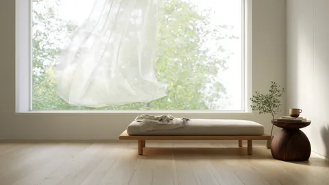
White (walls, ceiling, large textiles) provides the Nordic brightness. This is not stark white. It is the warm off-white of handmade paper, of afternoon light on a plaster wall.
Brown (wood floors, furniture, baskets) grounds the room. The wood tones matter — more on this in another article — but the principle is that natural, unfinished wood brings earth into an otherwise minimal space.
Green (plants, small ceramics, occasional textile detail) connects the room to living things. In a Japanese room, green is never artificial. It is moss, bamboo, a single branch in a vase, the color of a bonsai seen through glass.
Black (frames, lamp bases, furniture legs, thin lines of detail) is the one color that makes everything else legible. Without black, a room in white and brown and soft green can feel undefined, slightly fuzzy. A single black element — a thin-framed mirror, an iron candle holder — pulls everything into focus.
Think of black not as a color but as punctuation. A period at the end of a sentence. Without it, nothing settles.
The Accent: Three Colors Only
If you want to add color beyond these four, Japanese aesthetics offer a specific and narrow palette:
Crimson (朱色, shu-iro) — The red of torii gates, lacquerware, and temple pillars. Not a bright fire-engine red. A deeper, slightly muted red that feels ancient and intentional. Used sparingly — one cushion, one small vessel — it gives the room gravity.
Japanese Indigo (藍色, ai-iro) — The deep blue of indigo-dyed cloth, boro textiles, traditional noren curtains. It is closer to navy than to the bright aqua of Scandinavian design. This color is quiet and grounding in a way that lighter blues never are.
Sakura Pink (桜色, sakura-iro) — Not pastel pink. Almost-white pink, the color of cherry blossoms just before they fall. So pale that in most rooms it reads simply as a very soft neutral.
These three colors exist in Japanese tradition because they come from natural dyes — from plants, minerals, bark. They have a slightly dusty, slightly imperfect quality that manufactured colors do not. That quality is part of why they work in a Japandi room. They don’t compete with the natural materials around them.
Orange: A Special Case
Orange deserves its own explanation, because the instinct that orange belongs in Japanese spaces is actually correct. But the type of orange matters completely.
Orange as a furniture color — an orange sofa, an orange rug, an orange ceramic lamp base — does not work. It is too assertive. It fights with the wood tones and pulls the eye in a way that breaks stillness.
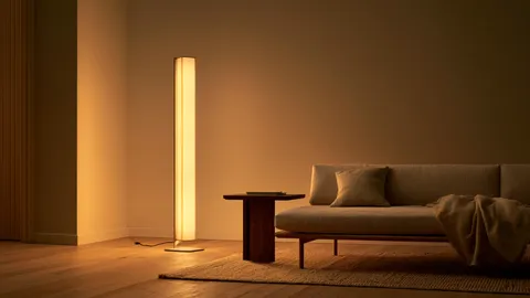
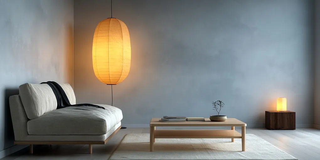
Orange as light works beautifully.
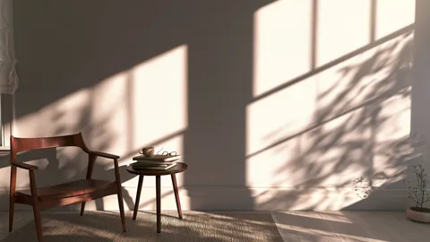
The warm amber glow of a washi paper lamp at 2200 Kelvin. A beeswax candle burning on a wooden surface. Late afternoon sun coming through a sheer curtain. This is the orange that appears in Japanese interiors — not as a pigment applied to objects, but as the quality of light that moves through the room at dusk.
In Japanese spaces, orange is not a color you buy. It is a color that arrives in the evening and leaves by morning.
If you want orange in your Japandi room, don’t shop for it. Change your light bulbs. Light a candle. Open the blinds at 4pm in October and let the sun do the work.
A Simple Test
Stand in your room and look at it with this question in mind: which thing is talking the loudest?
In a Japandi room, the answer should be a texture — the grain of the wood, the weave of the linen, the glaze on a ceramic bowl. It should never be a color.
If a color is what your eye goes to first, that color is doing too much. Start there.
Remove it, or replace it with something from the list above. Not because the rules say so, but because underneath the color, there is usually a very good room waiting to be quiet.
When you want texture to speak louder than color, this is where I’d begin: Japandi pillow covers in muted, earthy tones.