There is a moment that happens to almost everyone who starts putting together a Japandi room.
You have a light oak floor. You find a walnut coffee table you love — deep, warm, rectangular, exactly the right shape. You bring it home, set it down, and then stop. The floor is one color. The table is a different color. The wood doesn’t match.
And then the doubt sets in. Is this wrong? Should I return the table and find something in oak? Do all the wood tones in a room have to be the same?
The answer is no. They do not have to match. In fact, for a Japandi room specifically, matching all your wood tones is a mistake. (Mixing them well comes down to proportion — the same 70/30 idea behind the Japandi ratio — and if you’re new to all of it, start with what Japandi actually is.)
A room where every wood surface is the same tone looks like a showroom. A room where wood tones are mixed with intention looks like a home.
Here is why mixing works, and how to do it without the result feeling chaotic.
Why Matching Everything Goes Wrong
When every wooden surface in a room is the same tone — the floor, the furniture, the shelves, the frames — the room develops what designers sometimes call the showroom effect. Everything is coordinated. Everything matches. And the result feels oddly flat, like a furniture catalog rather than a lived space.
The reason is that our eyes read visual interest from contrast. When two elements are identical, the eye moves past them quickly. When two elements are similar but different — light oak floor, walnut coffee table — the eye slows down, registers the relationship between them, and the space reads as considered rather than assembled.
In a Japandi room, this contrast has a specific function beyond aesthetics. The lighter wood is carrying the Nordic base of the style — brightness, openness, the sense of natural light. The darker wood is carrying the Japanese element — weight, groundedness, the pull toward earth. The two tones in the same room are doing different things. Making them the same erases that tension, and with it, the Japandi quality itself.
The Rule That Makes It Work: Temperature Before Tone
Not all combinations of light and dark wood succeed. The ones that look wrong are almost always failing because of undertone conflict — the warm-cool mismatch that happens when two wood tones are pulling in different color directions.
Every wood has an undertone: the subtle color beneath its surface tone that determines whether it feels warm (toward orange, yellow, red) or cool (toward gray, green, ash).
Light oak has warm undertones — it has a slightly golden, honeyed quality. Walnut has warm undertones — it pulls toward rich brown and reddish-brown. These two share their underlying warmth, even though one is pale and one is dark. Put them together and the room feels cohesive.
Light ash, on the other hand, has cool undertones — it has a slightly gray, silvery quality. Dark-stained wood in cold gray-black tones also reads cool. These two can work together. But if you put warm-undertone light oak next to cool-undertone dark gray-stained wood, the room feels slightly off in a way that’s hard to name — because the two pieces are disagreeing at the undertone level.
How to check undertone in practice
Hold a piece of natural light wood — a small sample, the back of a shelf, an unfinished edge — next to a warm white (cream, ivory) and then next to a cool white (blue-white, bright white). If the wood looks better next to the warm white, it has warm undertones. If it looks better next to the cool white, it reads cool.
Do the same with any darker piece you’re considering pairing it with. If both read warm, they will likely work together. If one reads warm and one reads cool, they will fight.
For Japandi specifically: you want warm undertones throughout. Warm-toned light oak paired with warm-toned walnut or dark cedar is the classic combination — and it’s the one that looks most naturally Japanese, because Japanese woodworking has always favored warm wood tones over cool ones.
The 70/30 Distribution
Knowing that two tones can mix is different from knowing how to distribute them. This is where most attempts go wrong — not because the combination is wrong, but because the proportions are off.
The proportion that works for Japandi: roughly 70% lighter wood, 30% darker.
The lighter tone dominates. It covers the floor, the larger furniture pieces, the structural elements that determine the room’s overall character. It provides the Nordic openness that makes the room feel livable and bright.
The darker tone anchors. It appears in the pieces that sit at lower visual weight — the coffee table, a side table, a chair frame, a shelf edge, a wooden tray. It creates the pull toward earth that gives the room its Japanese quality.
What this looks like in practice
A light oak floor (the largest light wood surface in the room) with a walnut coffee table and walnut-framed dining chairs. The dining table itself stays in lighter oak — because it is large, and making it dark would flip the balance toward 50/50 or beyond.
Or: light oak shelving and a natural oak sofa frame, with a low dark-stained wood bench near the door and a cedar tray on the coffee table. The dark elements are smaller and fewer, but they are present and felt.
The test: stand in the doorway and look at the room. Does it feel predominantly light and open, with some deeper tones that hold it in place? That is the right proportion. If it feels heavy or dark, the balance has shifted too far toward dark. If it feels entirely uniform and flat, there is not enough dark.
Using Fabric as a Buffer
There is one specific situation where mixing wood tones creates difficulty: when a dark floor and a light furniture piece (or vice versa) sit directly next to each other with nothing between them.
The contrast in that case is often too abrupt. The eye reads it as a clash rather than an intentional pairing, because the transition is too sudden.
The solution is a rug — placed between the floor and the furniture to create a visual transition zone.
A natural fiber rug in a neutral mid-tone — warm oat, natural undyed wool, a low-pile jute — absorbs the contrast between the dark floor and the lighter furniture sitting on it. The eye reads the sequence as: dark floor, soft neutral buffer, light furniture. The contrast is still present, but mediated.
This is also why, in most well-executed Japandi rooms, there is a rug under the main seating area even when the floor itself is attractive. The rug is not primarily decorative. It is structural — it is managing the relationship between the floor and the furniture above it.
The Specific Mistake: All Blonde, No Dark
The most common wood-tone problem in American Japandi rooms is not that people mix wrong — it is that they do not mix at all.
IKEA and most accessible American furniture stores default to blonde wood: light beech, white-stained pine, pale ash. These are beautiful materials and they form a good Nordic base. But a room furnished entirely in blonde wood has no Japanese element at all. It is purely Scandinavian.
The single most effective change most Japandi rooms need is not an overhaul — it is adding one piece of genuinely dark wood.
A walnut coffee table in a room of light oak furniture. A dark-stained side table next to a blonde wood sofa. A low bench in deep cedar near the entry. One piece of dark wood with straight lines and warm undertones, placed where the eye naturally rests, does more to shift a room from “Scandinavian” to “Japandi” than almost any other single intervention.
The dark wood is not decoration. It is the weight that makes the rest of the room feel considered.
The Shape That Reinforces the Tone
One final thing worth knowing: the shape of a dark wood piece amplifies or diminishes its effect.
Dark wood with straight lines, right angles, and a low profile reads as Japanese — it carries all the associations of traditional Japanese furniture, which tends toward the geometric and the grounded.
Dark wood with rounded edges, tapered legs, or a curving form reads as Scandinavian-with-dark-stain — which is a different thing entirely, and can muddy the Japandi character of the room.
When you are adding a dark wood piece to anchor the Japanese element of a Japandi room, choose the most geometric, rectangular form available. Low. Square or rectangular top. Straight legs, ideally in a slightly darker tone than the surface. The silhouette should communicate: this is the Japanese part.
The blonde pieces around it can carry some curves — that is appropriate for their Nordic role. The dark piece should be quiet and precise.
The Combination That Always Works
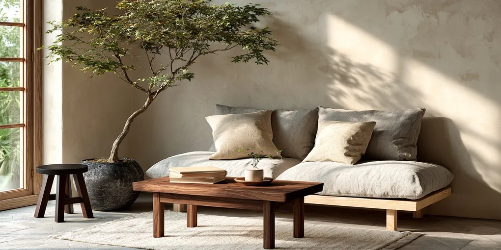
If you want one reliable starting point: warm white oak floor, walnut coffee table, one or two walnut-framed chairs or a walnut side table. Natural linen or undyed wool textiles as the buffer layer.
This combination works because the undertones align (both oak and walnut are warm), the proportions are natural (the floor and main furniture in light, the accent pieces in dark), and the shapes can do the work of differentiating the Nordic from the Japanese element.
You can build the rest of the room from there — adding the ceramics, the single plant, the warm lamp, the deliberately empty corner — and the wood will hold it all together without drawing attention to itself.
Which is exactly what wood in a well-made room should do.