This post contains affiliate links. As an Amazon Associate, I earn from qualifying purchases.
A throw pillow cover is the closest thing a room has to an undo button.
It is the only element in a Japandi room that can be changed in five minutes, for under thirty dollars, with results you feel the moment you sit down. Not because it is decorative — that is the wrong way to think about it — but because it changes the texture and colour temperature of a room with a precision that no other single item can match.
It is also the single easiest place to get the colour wrong. Before you buy, it’s worth reading why I’d strip the pastels — the aqua, mustard, and dusty rose that quietly undo a Japandi room usually arrive on a throw pillow.
This article is about choosing well. Not boldly, not trendily — but in a way that settles the room rather than unsettles it.
Why Trust This Guide?
I’m Japanese, and I write about Japandi from the cultural side rather than the trend side. These selections are based on material, texture, colour, and how each cover fits within a Japandi interior — not on popularity, sponsored placements, or paid recommendations.
At a Glance
| Cover | Best For |
|---|---|
| FUTEI Chenille Stripe | A room that needs warmth and softness |
| Foindtower Linen Check | Clean, unfussy farmhouse-Japandi |
| Cozoomy Corduroy (4-pack) | Texture without pattern |
| Meekio Linen Blend | Grounding a room with dark moss green |
| Hckot Linen Stripe | Quiet structure without committing to colour |
What Makes a Pillow Cover Actually Japandi?
Before the list, a quick filter — because there are many “neutral” pillow covers that are neutral in the wrong way.
A Japandi pillow cover doesn’t add interest. It adds texture. There’s a difference.
Here’s what I look for:
Material: Natural fibres, or convincingly natural. Linen, linen blends, cotton chenille, corduroy. Nothing that slides against your hand or looks like it belongs on a hotel bed.
Colour: Muted, earth-rooted, and anchored in the room. Olive, moss, taupe, warm beige, natural linen. Not grey-blue, not navy, not anything that requires explanation.
Pattern: If there is one, it should be structural — a stripe, a check — rather than decorative. Japandi doesn’t do florals, geometric prints, or anything that competes with the quietness of the room.
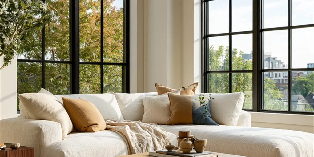
Quantity: Two or three on a sofa. Not five, not six. In Japan, a pillow is a functional object first. Excess pillows that must be moved every time someone sits down is not calm — it is clutter with a cushion cover on.
With that in mind — here are five that pass.
The 5 Best Japandi Pillow Covers on Amazon
1. FUTEI Chenille Embossed Stripe Pillow Cover — The One That Earns Its Place
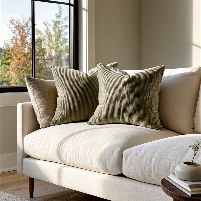
If I were to pick one fabric that feels most distinctly Japanese in the context of a pillow, it would be chenille.
Not because it is traditional — it isn’t — but because it embodies a principle that runs deep in Japanese material culture: the idea that a surface should reward touch. Linen looks honest; chenille looks like it invites the hand. The subtle ribbing of the embossed stripe on this cover gives it a quiet visual rhythm that reads as intentional rather than decorative.
The olive green colourway is particularly well-suited to Japandi interiors. It is green in the way that matcha is green — not bright, not obvious, but unmistakably present once you notice it.
What I like: The embossed stripe means this cover has texture without pattern, which is a difficult balance to find at this price point. It works as an accent without demanding attention.
Who it’s for: Anyone whose sofa reads as too plain or too pale. One or two of these introduces warmth and depth without introducing colour in a way that requires everything else to change.
2. Foindtower Linen Check Pillow Cover — The Quiet Farmhouse
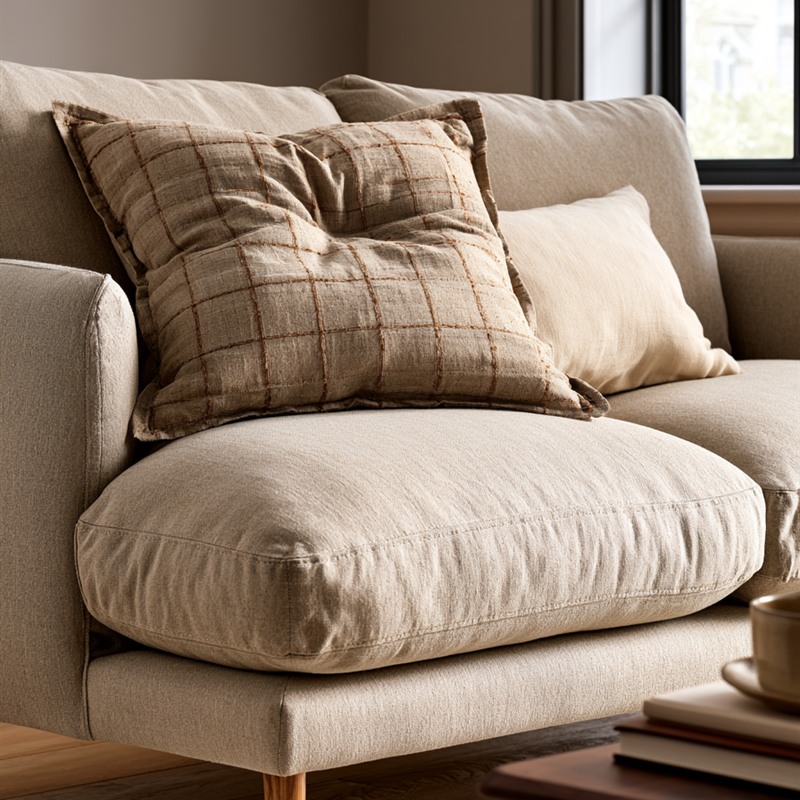
There is a version of the check pattern that is loud — plaid in primary colours, the Scottish tartan. And there is a version that is almost invisible: a tonal check woven in natural linen, where the grid only appears as you look closely.
This is the second kind.
The Foindtower uses a linen texture with a subtle woven check in natural, vintage-leaning tones. The result reads as texture first and pattern second — exactly where Japandi wants it. It pairs particularly well with solid covers in warmer colours, which is how I’d suggest using it: one check, two solids, all in the same tonal family.
What I like: Its combination of natural fibre texture and structural pattern makes it a practical fit for Japandi interiors that lean slightly warmer or more farmhouse-adjacent. It does not look like a statement — it looks like the room has always included it.
Who it’s for: Rooms that want a hint of pattern without committing to anything bold. Works well alongside solid linen covers in beige or cream.
3. Cozoomy Corduroy Pillow Cover — The Texture Purist
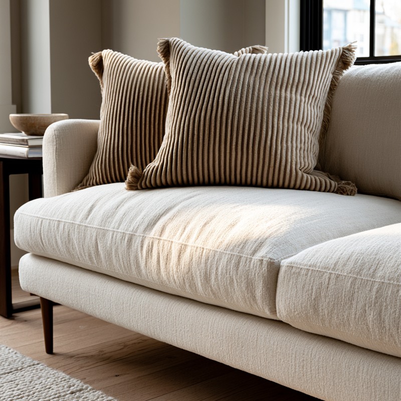
Among linen, chenille, and corduroy — the three materials most suited to Japandi pillows — corduroy is the most tactile.
Linen tends to be cool and slightly rough, like a well-washed shirt. Chenille tends to be soft, with a little give. Corduroy sits between them: a ribbed, directional pile that generally reads as firmer than chenille, and that appears to shift shade depending on which way it lies.
In a Japanese context, this quality — the way a surface responds differently depending on how you engage with it — is valued. A Japandi room is meant to be inhabited, not photographed. Corduroy is the kind of material whose character is tactile as much as visual — something a product photo can only partly convey.
This set comes as four covers in beige, which is both practical and aesthetically sound: four identical covers means a matching pair for your sofa and a spare pair for when one needs washing, or for a second piece of furniture.
What I like: The four-cover set offers flexibility — pair two on a sofa, or mix with other covers from a similar tonal palette. Beige corduroy in particular is one of the safest choices in Japandi: warm enough to not feel cold, neutral enough to not compete.
Who it’s for: Anyone who is starting from scratch with pillows, or who wants a reliable neutral base to mix other covers into. Also the right choice if you care more about how a pillow feels than how it looks.
4. Meekio Linen Blend Pillow Cover — The Grounding Accent
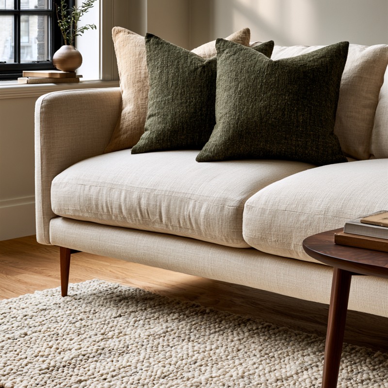
A room can be too neutral.
Not because neutrals are wrong, but because a room made entirely of beige, off-white, and light wood eventually begins to feel like a waiting room. It is calm but not alive. In a Japandi interior, the corrective is almost always a single grounding colour, placed once, in a material that doesn’t announce itself.
Dark moss green is that colour for many rooms.
Meekio’s linen blend in dark moss green is restrained in the way that only natural, muted colours can be. It isn’t forest green or emerald — both of which read as a choice. This is the colour of old leaves, of stone after rain. It anchors without drawing attention.
What I like: The linen blend gives this cover an appropriately honest texture — not polished, not synthetic. Against a beige or cream sofa, one cover in this colour is enough to change the feeling of the room.
Who it’s for: Anyone whose Japandi room feels too pale or too monochromatic. This is the single accent that requires nothing else to change around it.
5. Hckot Linen Stripe Pillow Cover — The Structure Behind the Calm
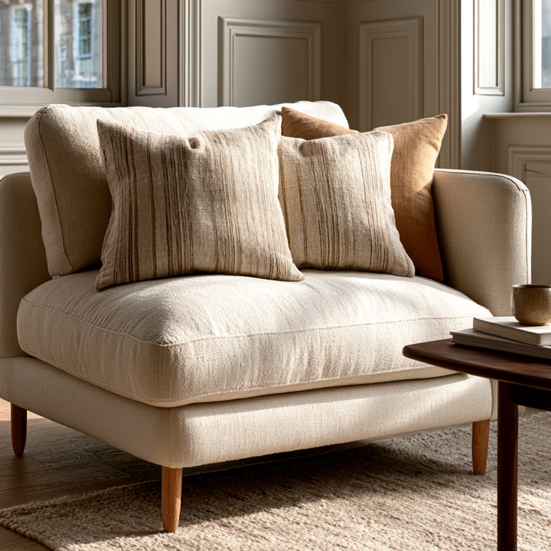
The last cover on this list is also the most understated.
The Hckot is a natural linen cover in a tonal stripe — taupe and khaki tones so close in value that the stripe reads as shadow rather than contrast. The result is a cover that has structure without competing with anything around it. It is the kind of pillow that works in almost every configuration: alongside solids, alongside checks, in a monochrome arrangement, or alone on a chair.
In Japanese aesthetics, this quality has a name: hikae-me, or self-restraint. An object that does not try too hard. The Hckot earns its place by asking for nothing.
What I like: Its combination of natural linen texture and tonal stripe means it functions as both a neutral and a layer of visual interest simultaneously. It is probably the most quietly versatile cover on this list.
Who it’s for: Anyone who wants a Japandi pillow that works regardless of what changes around it. A reliable starting point, or the last piece that finally makes a mixed arrangement feel resolved.
Which One Should You Choose?
A quick guide:
- Your sofa is pale and feels too plain: FUTEI Chenille (olive green adds warmth)
- You want a hint of pattern without committing to colour: Foindtower Linen Check
- Texture matters more than appearance: Cozoomy Corduroy 4-pack
- Your room needs a single grounding accent: Meekio Dark Moss Green
- You want something that works with everything: Hckot Linen Stripe
A Few Things I’ve Noticed About Pillows and Japandi
The pillow is the only item in a Japandi room where the decision can be completely reversed in minutes. That is both its appeal and its danger.
The appeal is obvious: if the room isn’t quite right, you don’t have to buy a new sofa to fix it. One or two covers in the right material and colour can shift the atmosphere of a room more than most people expect.
The danger is that this ease of change becomes a habit of accumulation. There is a specific failure mode I see often in American interiors: the sofa that disappears under eight pillows in five different sizes, four patterns, and three colour families. The sofa becomes storage for pillows. No one sits on it comfortably because there is nowhere to sit.
In a Japandi approach, two or three covers is the ceiling. Choose them deliberately, from the same tonal family, and place them intentionally. Two on a two-seater. Three on a three-seater. That’s the arrangement — and it holds.
One more thing about colour. The simplest rule I follow: look at the room and find one colour that is already there, then add one pillow that repeats it. If there is a plant by the window, add a green. If the coffee table has a dark walnut edge, add a taupe or brown. Don’t introduce a new colour — confirm one that is already present. The room doesn’t need more; it needs coherence.
A Japandi interior is not built by adding the right things. It’s built by choosing fewer things, more carefully.
That applies to pillows more than almost anything else.
Frequently Asked Questions
How many throw pillows does a Japandi sofa need?
Two to three is the Japandi range, and I’d treat three as the maximum. A sofa covered in pillows loses its clarity — the sofa disappears and so does the sense of rest the room is trying to create. Two pillows on a two-seater, three on a larger sofa, all in the same tonal family. That’s enough.
What materials should I look for in a Japandi pillow cover?
Natural fibres or convincingly natural textures: linen, linen blends, cotton chenille, and corduroy are the most suited to a Japandi interior. Each offers a different tactile character — linen tends to be cool and slightly rough, chenille soft, corduroy firm and directional. Avoid anything that looks too polished or synthetic. Japandi pillows should reward touch, not just appearance.
What colours work best for Japandi throw pillows?
Muted earth tones are the safest ground: natural linen, warm beige, taupe, khaki, and muted greens (moss, olive, sage). The key is to choose colours that are already present somewhere in the room — in the wood tones, in a plant, in a ceramic piece — and repeat them rather than introduce something new. One accent colour, once. That’s the Japandi approach.
Can I mix different pillow covers on the same sofa?
Yes, but within limits. The simplest rule: stay within one tonal family. Mix a solid linen beige with a tonal stripe in taupe, or a corduroy neutral with a chenille in olive. The textures can be different; the colour temperature should be consistent. Avoid mixing warm and cool tones on the same sofa — the result tends to feel unresolved rather than curated.
As an Amazon Associate I earn from qualifying purchases. All opinions are my own.